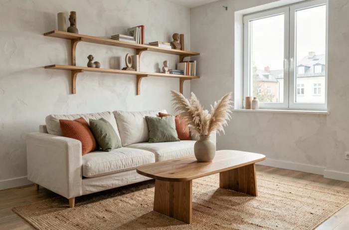
This year’s interior design trends mark a clear shift towards less staged and more livable interiors. Three main axes structure this movement: the return of raw materials treated with precision, a color palette that embraces bold contrasts, and the integration of second-hand furniture as the centerpiece of a decor project.
Light as a zoning tool in interior decoration
Light is no longer just a functional fixture. It becomes a lever for spatial composition, just like furniture or wall color. The principle: create distinct ambiance zones within the same room without partitioning.
In practice, different light sources are layered at varying heights and color temperatures. A low-hanging pendant above a dining table delineates the dining area. An adjustable floor lamp near an armchair creates a reading nook. Each light source defines a use, not just illumination.
This zoning by light responds to the evolution of lifestyles in open spaces. When the living room, dining room, and office share the same area, visual transitions replace partitions. Dimmers and adjustable temperature bulbs allow for modifying the atmosphere of one zone without affecting the rest.
For those who wish to explore the decor section of Incroyable Maison, pendant lights and accent lamps are a good entry point for working with this type of lighting staging.
Second-hand furniture: centerpiece, not accessory
Vintage or refurbished furniture is changing its status. It no longer plays the role of a decorative accent slipped between two new pieces. The second-hand furniture market now represents a significant share of sales in France. This volume reflects a structural shift in the market.
The expert approach is to build a room around a strong vintage piece, not the other way around. A dark wood sideboard from the 1960s, a weathered farmhouse table, or a restored club chair become the starting point of the project. The rest of the furniture and textiles coordinate with this central piece.
Selection criteria for a structuring second-hand piece
- Check the integrity of the structure (joints, legs, hinges) before any aesthetic considerations, as a veneer often masks a weakened frame
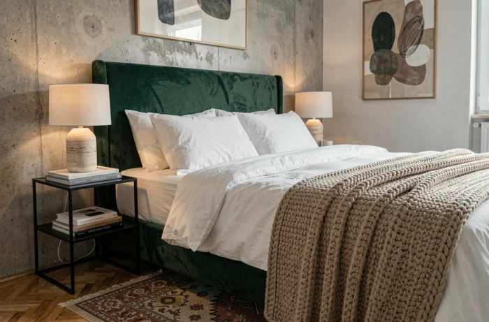
- Favor dark wood species (walnut, rosewood, smoked oak) that align with the current trend for dark furniture
- Assess the natural patina of the material: a uniformly redone varnish diminishes the visual value of the piece
This logic also applies to small spaces. A well-chosen antique side table adds more character than a complete set of standardized contemporary furniture.
Trendy colors: bold contrasts and earthy tones
This year’s palette is not limited to a flagship color. It relies on contrasting associations, where earthy warm tones meet saturated cool hues.
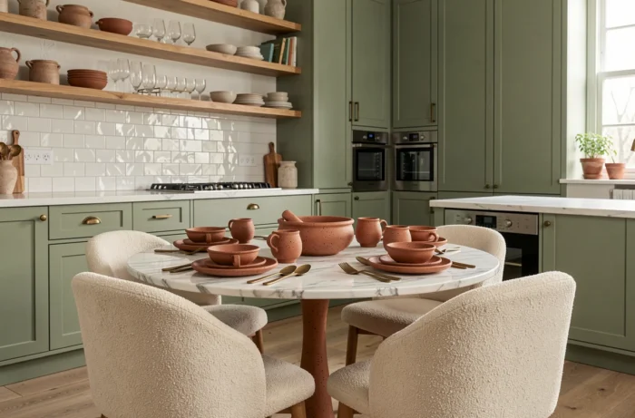
Terracotta remains a staple. Its enveloping warmth works as a flat color on an accent wall or in textile touches (cushions, throws, curtains). Olive green and mushroom brown complement this organic range with a sophistication that beige alone does not produce.
Color drenching: a technique to master
Color drenching, which involves applying the same shade to walls, baseboards, woodwork, and ceilings, is gaining traction. The monochrome effect visually enlarges the space and eliminates visual breaks between architectural elements.
This technique works particularly well with medium shades (neither too light nor too dark). A sage green total look transforms a bedroom. A blue-gray applied from floor to ceiling in an office creates a focused atmosphere without austerity.
A common mistake: choosing a color that is too bright for an integral drenching. Muted and powdery shades better withstand visual saturation on large surfaces.
Raw materials and PFAS-free textiles: what changes in practice
Light wood, waxed concrete, and raw stone continue to dominate interior decoration projects. Their success lies in their ability to create a calming atmosphere without resorting to complex finishes. Wood, in particular, is being used this year in darker tones than before, in line with the return of dark furniture.
On the textiles side, one technical parameter deserves attention. Regulations on PFAS also concern home textiles: curtains, cushion covers, tablecloths. Stain-resistant and water-repellent treatments applied to certain fibers, including natural ones, may contain these substances. Checking the manufacturer’s indications on surface treatments becomes a useful reflex when choosing decor textiles.
- For curtains: favor untreated dense weaves (heavy linen, cotton twill) rather than fine fabrics with water-repellent treatment
- For covers and cushions: Oeko-Tex or GOTS certifications indicate the absence of problematic chemical treatments
- For rugs: plant fibers (jute, sisal) or untreated wool offer an alternative to treated synthetic fibers
Revisited hotel style: comfort of use before visual effect
Hotel-inspired decoration is evolving. According to a trend report published by Archiproducts in September 2026, the most notable hotel spaces focus on comfort, multiple uses, and a local identity, rather than on spectacular effects.
Translated to the home, this principle translates into concrete choices: a reading nook with deep seating and dedicated lighting, an entryway designed as a transition space (bench, hooks, mirror), a workspace integrated into the living room without style disruption. Each zone responds to a specific use without sacrificing aesthetic coherence.
Local or artisanal materials, handmade ceramics, and regionally woven textiles also contribute to this approach. They anchor the space in an identity rather than a generic trend. This is what distinguishes a lived-in interior from a decorated one.
This year’s decor trends converge towards a single principle: a home that functions daily takes precedence over one that impresses in photos. The choice of textiles, in particular, benefits from being checked at the time of purchase to avoid undesirable chemical treatments.